Archive for the ‘New Uniforms’ Category

[NEW UNIFORMS] One Blogger Is Fined For Using Moniker "Devil Rays"

February 5, 2008

Seriously…We can’t make this shit up.

Baseball Musings has still been referring to the Tampa Bay Rays as the “Tampa Bay Devil Rays”. Well, after receiving a letter from Matt Silverman, president of the Devil Rays, they can no longer use the excuse that they “didn’t get the memo”. Baseball Musings was fined $1 by the Devil Rays for using the term (the money does go to a Devil Rays charity).

The Tampa Bay Rays found out I was still sometimes using the name “Devil.”
They’ve asked me to stop. I’ll be sending in a $10 fine.

(HERE is a link to a scan of the actual letter from the Devil Rays. Below is the full text of the letter from Devil Rays president Matt Silverman.)

February 1, 2008

Dear Mr. Pinto:

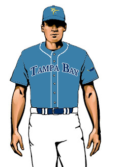
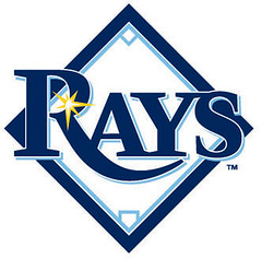
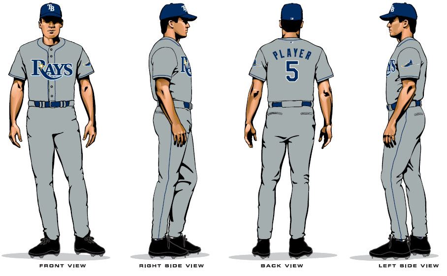
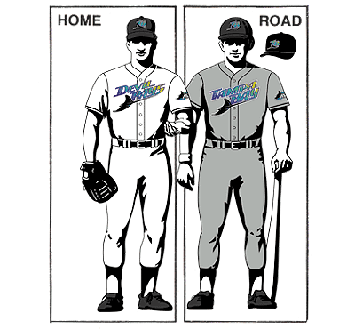
November 8, 2007 was a landmark day for our organization. On that day, we shed the “devil” from our name and became the Tampa Bay Rays. Our organization introduced a new logo, colors and uniforms to accompany the name change. A bright yellow sunburst now adorns our jerseys. Replacing the devil ray fish, this sunburst icon invokes the magnificence of life in the Sunshine State.

Thousands of Rays’ fans flocked to downtown St. Petersburg to celebrate the launch of our new team name. Players flaunted their new threads and described them as “fresh.” Community leaders and even Hollywood’s Kevin Costner joined in the fanfare.

Although these changes have been widely embraced, old habits often die hard. Here at our offices in Tropicana Field, we created “Drop the Devil” donation boxes. For each and every Devil Rays mention, employees must contribute one dollar to the donation box. All proceeds benefit the Rays Baseball Foundation, the official charity of the Rays which supports youth and education programs in the Tampa Bay community. Though costly for a forgetful few, it has been both fun and instructive, while also benefiting a worthy cause.

It has been brought to my attention that you, too, recently used our former team name. Accordingly, the Rays request a donation to the Rays Baseball Foundation in the amount of one dollar (though larger contributions are welcomed). Please note that repeat violations may carry a steeper penalty.

Thank you very much for your attention to this matter. We hope to see you this season at a Rays’ game.

Yours truly,
Matt Silverman
President, Tampa Bay Rays

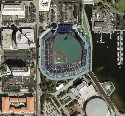
Wow. We guess that this means we will not be seeing any Devil Rays “Turn Back The Clock” nights anytime soon. Our favorite part is how the “sunburst icon invokes the magnificence of life in the Sunshine State”. Huh-wha? Of course, it does not invoke the magnificence of play in the Tropicana DOME, the home of the Devil Rays, which you know…has a roof. And where is our letter from the Devil Rays? We are apparently not invoking the use of the term “Devil Rays” nearly enough.

Other fines that Devil Rays’ employees can soon be expecting:

  • For wearing anything green. St. Patty’s Day is going to suck this year at Devil Rays headquarters. Of course last year on St. Patrick’s day, the Devil Rays actually wore less green than normal. It was prophetic.
  • For ever mentioning the name Chuck LaMar. OK, this is one that we will gladly enforce.
  • For any references to the movies Water World, the Postman, or any other crappy Kevin Costner flick.

I’m In Trouble! [Baseball Musings]

<!–
google_ad_client = “pub-1087703869302621”;
/* Post footer */
google_ad_slot = “6400567706”;
google_ad_width = 468;
google_ad_height = 60;
//–>

<script type=”text/javascript”
src=”http://pagead2.googlesyndication.com/pagead/show_ads.js”&gt;

[NEW UNIFORMS] Possible Glimpse At Tampa Bay Rays Alternate Uniform To Debut In 2009

December 12, 2007


As we mentioned earlier in the week, Joe Maddon is cooking and helping to distribute meals to local area shelters in an annual event called “Thanks-mas”. If you go to DevilRays.com, there is a front page press release covering Thanksmas, that is being run with the following picture [Ed. note: the image has now been removed][Ed. note: we have been informed that this particular cap was created by BayNews9 and given to Maddon for this event].

The image shows Joe Maddon cooking food in preparation for Thanksmas. What is interesting about the picture is that Joe Maddon is wearing what appears to be an authentic NewEra cap in the Tampa Bay Rays’ new lighter blue color featuring the Rays’ new “sunburst” logo.

After the new uniforms were unveiled there was considerable uproar among Rays fans that the team’s new uniforms will not feature “Tampa Bay” on the road uniforms. When asked about this, the team indicated that there would be an alternate uniform unveiled in 2009 that will feature “Tampa Bay” across the chest, without any further details.

Could the cap being worn by Joe Maddon be the cap associated with the yet-to-be-unveiled alternate uniform? This would make sense as it is the alternate color and features the new “sunburst” which the team wants to become the new identity of the franchise.

We took this new cap and tried to project what the alternate uniform would look like and came up with the following image found at the beginning of this post. If people thought the new uniforms were boring. If the alternate uniform looks like this, it will be anything but boring.

Rays’ Maddon Cooking Up Another “Thanks-Mas” Feast [TBO]
Joe Maddon’s Thanksmas returns bigger and better [Devil Rays]
Rays To Feature Alternate Jersey In 2009 With “Tampa Bay” Across The Front [Rays Index]

[THE HANGOVER] Rays To Feature Alternate Jersey In 2009 With "Tampa Bay" Across The Front

November 16, 2007

Tampa Bay Devil Rays (66-96)

DEVIL RAYS WEBTOPIA

  • Marc Lancaster is reporting that the Rays will feature an alternate jersey in 2009 and it will have “Tampa Bay” written across the front. [TBO]
  • Baseball America previews the quarterfinals of the World Cup. Team USA is the top seed and will face Korea today. [Baseball America]

Evan Longoria (Rays) has rotated with LaRoche between playing third base and DH, and the 2006 No. 3 overall pick is 10-for-28 with two home runs, a triple and two doubles (.357/.379/.714). The former Long Beach State shortstop has also shown good defensive skills at third base.

Outfielder Justin Ruggiano (Rays), who made the team after Minor League Player of the Year Jay Bruce (Reds) dropped out to nurse a sore hamstring, hit two home runs in Team USA’s 10-7 victory over host Taiwan in the final game of pool play. With a team-best three home runs, Ruggiano is 7-for-20 with a .350/.480/.800 line.

  • If there is anyplace that prospects get together you can be sure Baseball America will make a list. This time it is the “Arizona Fall League Top 20 Prospects”. Both Evan Longoria (2) and Reid Brignac (7) made the list. Brignac made the list despite going 1-642 (or something like that). [Baseball America]
  • In an informal meeting, the Rays presented Bud Selig with their plans for a new stadium on the site of Al Lang Field. [tampabay.com]
  • The Devil Rays have announced several changes in the last week. New Uniforms. A New Name. A New Stadium. That leaves only one more change that needs to be announced. A new sport. Maybe the Tampa Bay Rays would be more competitive as a minor league hockey team. However, we are not sure Carl Crawford’s speed would be best utilized as a goalie. Not to mention he has a below-average glove. [The Onion]

NEW STADIUM The Tampa Bay Rays Distract Fans With Plans For New Stadium

November 12, 2007


[Ed. Note: We are reposting this from Saturday because we know nobody reads the internet on the weekend]

On Thursday the Tampa Bay Devil Rays unveiled their new uniforms and logos and officially announced that they would be changing their name to the “Tampa Bay Rays”. Knowing that these moves would anger a large percentage of the team’s current fans, the front office decided that Friday would be a good time to distract the fan base with a real big cookie. A cookie big enough to seat 35,000.

On Friday, the Rays leaked to the press, plans to build a 35,000 seat-open-air baseball stadium to be built along the bay at the current site of Al Lang Field (AKA Prospect Energy Park).

The Tampa Bay Rays have developed a bold plan to build a $450-million downtown stadium that would give fans waterfront views and protection from rain…The stadium, to be built on the site of Al Lang Field, would seat about 35,000 and could open as early as 2012. Hitters there would have a chance to send the ball into the bay…Financing is still being worked out, but a primary source would be proceeds of the sale of the Tropicana Field site to a developer who would build a large retail/residential complex there. The Rays also would make a contribution, perhaps as much as $150-million, covering one-third of the cost…The team also would seek legislative approval for $60-million of state money in future sales tax revenue from food, beer and merchandise sales in the new park.

The idea of the Rays playing in an open-air stadium that overlooks the bay makes us giddy as a school girl. The innovative idea of using two sail-like structures to cover the field in the event of rain, is such a simple and obvious idea, it can only be described as brilliant considering nobody had thought of it before. Our only question (besides wondering how plausible the funding scenario is) is how will the new stadium fit in the proposed location.

Based on the description of the stadium, home runs over the right-field fence would have a chance of landing in the bay, and left field would sit above the current parking lot on the north side of Al Lang Field. The problem with this scenario is that even a small minor league park such as Al Lang Field would not fit in the space provided between Bayshore Dr. and 1st St.

We decided to see exactly how a new stadium would fit into the allocated space.

Here is an aerial view of Al Lang Stadium

As can be seen from the aerial view, Bayshore Dr (to the east) and 1st St. (to the west) draw closer together traveling north past the stadium. Even Al Lang Stadium would not fit between those two streets if it were shifted even slightly to the North.

Based on the description of the proposed stadium (35,000 seats, open air), the closest approximation we could come up with was the new PNC Park in Pittsburgh which seats 38,500. In fact, PNC Park works well, because the right field wall runs parallel to the river in Pittsburgh.

We took an outline of PNC Park, drew it to scale and overlayed it on the above image.

If the new park is rotated and shifted, so that right field is along the water and left field is over the current parking lot, the stadium would need to be pushed out over the water, so as to avoid disrupting 1st street. Doing so, would require the city to shut down Bayshore Dr. In fact, part of the bay would have to be filled in to accommodate the new stadium.

Here is an idea of what a new stadium would look like from an aerial view, using PNC Park as a reference.

Is it possible that the Tampa Bay Rays could be playing in a new open-air stadium as early as 2012? We are not getting our hopes up yet, as team and city officials still have a lot of hoops to jump through. And we are still not absolutely certain a new stadium would fit in the proposed location, but if the goal of the team was to divert the attention of their fans…it worked. We barely remember that Kevin Costner has made a lot of bad movies.

Rays on the bay? [TampaBay.com]
For Better Or Worse, The New Uniforms Are Now Official [Rays Index]

NEW UNIFORMS For Better Or Worse, The New Uniforms Are Now Official

November 9, 2007


[Update: CLICK HERE for what may be the Rays alternate uniform to be used in 2009 that will feature “TAMPA BAY” across the front]

The Tampa Bay Devil Rays found a way to piss off 360 of their 522 fans.

Yesterday, the Tampa Bay Professional Baseball Club officially unveiled their new uniforms. This change was has been in the works since the new ownership group took control of the franchise following the 2005 season, and sketches of the new uniforms were first leaked on the internet on September 20th of this year.

The logos are as first reported, but as we mentioned back in September, we needed to wait until we saw the uniforms “live” before passing judgment, as the coloring is very different when compared to the original sketches, as can be seen in this side-by-side comparison.

The main blue color is clearly much darker (very good). The lighter blue is not nearly as noticeable (good) and the sunburst is almost unnoticeable (thank god). Now that we have seen what the colors look like on the actual uniforms, the comparison to the Seattle Mariners, Texas Rangers and especially the Kansas City Royals, seems much less warranted.

Even the grey on the road uniforms is much different than the original sketches, as the color seems to have much less of a blue hue.

Overall we actually like the new color scheme. Yes we understand the green was unique and the blue is less so, but we truly believe there would be more of an uproar if the team were switching from these colors to the green, blue and white of the last few years.

We don’t mind the new colors (we always hated the green alternate jersey), but we understand a lot of fans hate the new design. While some approve and many disapprove of the new hues, there are two other changes that seem to have angered the few loyal fans the Rays do have…

First and foremost is the change from “Devil Rays” to “Rays”. In doing so, the Rays become the first baseball team since the Houston Colt ’45s to change their nickname without moving. This screams boring and unnecessary. David Chalk, who covers the Rays over at Bugs & Cranks is campaigning his editors to keep using the moniker “Devil Rays” and we couldn’t agree more. The team has not used the full name “Devil Rays” on the uniforms since the original Rainbow Warriors set was last used in 2000. So then why the need to change the name? Because some people take offense to the term “Devil”? Sometimes people listen to marketing strategists a little too much. Good idea or stupid? Your fans say “Stupid”. The Rays removed the offensive term and gained a boring one. David Chalk wants to continue using “Devil Rays” on Bugs & Cranks and we hope he does, because we will continue to use the moniker on this site. In fact, we will probably use “Devil Rays” more often.

The second change that has Devil Rays fans up in arms is the removal of “Tampa Bay” from the road uniforms. Many fans are worried that this is a sign of an impending move from the Bay Area. This is another marketing strategy being employed by the team which just goes to reinforce the popular notion that the front office cares more about making money than they do about winning baseball games. The team has a new logo (Rays with a sunburst) and their goal is to push that logo every chance they get and that includes being used on the road uniforms in away cities.

In addition, the team is hoping that the Rays will become a more regionalized entity. There is nothing wrong with that desire, but removing “Tampa Bay” from the away uniforms will have ZERO effect on whether or not people in Orlando will buy Rays merchandise. There are teams littered throughout the four major sports leagues that do well selling merchandise outside of their home area. They do this in spite of having their city name labeled on their away jerseys. The key to marketing outside of your home area is simple. WIN. Win more games. Challenge for the playoffs on a consistent basis. GO TO THE PLAYOFFS every once and a while and all of the sudden fans in Walla Walla will start buying and wearing Rays merchandise, and they won’t give two shits whether or not it says “Tampa Bay” on the front. People in/from Tampa and St. Pete and the surrounding areas are damn proud to be from those places. They want to root for a team that is proud to be from that area also.

Now that we have seen the final product, we must say we do like the color scheme, but we understand why a lot of fans will not. However, we are irate about the name change and the failure to show any pride whatsoever in where the team is from. In the end, the Rays may have alienated more fans than they gained from these changes.

[Update: From a purely aesthetic point-of-view, Mrs. Professor says she prefers the new set, but it was a close call and trust me she has more style sense than any of us]

New Rays Dawning? [TampaBay.com]
The New Tampa Bay Rays Uniforms [Rays Index]
Fighting For The Devil & The Soul Of Bugs & Cranks [Bugs & Cranks]

NEW UNIFORMS The Devil Rays Know How To Be Overdramatic

November 6, 2007


The time is almost here when the Tampa Bay Devil Rays will announce to the world what we already know. And boy, you would have thought the Rays were set to announce the acquisition of Alex Rodriguez, Johan Santana, Mariano Rivera and the 2008 World Series.

New uniforms. New colors. New logo. New name. Everything is new and Tampa Bay has an All-Star weekend planned to unveil their changes to the public…The festivities kick off on Thursday afternoon in downtown St. Petersburg’s Straub Park, in a free night of excitement for fans of all ages. At 4 p.m. ET the interactive activities kick off the evening…At 5:30 p.m., manager Joe Maddon, Hall of Famer Wade Boggs and former Ray Fred McGriff will hit the catwalk to model the Rays’ new uniforms, logos and colors…Next is a special treat for any baseball fan, but especially those of classic baseball movies. At 6:30 p.m., Kevin Costner and his band, Modern West, will take the stage for a rock-and-roll concert…Thursday evening will conclude with an 8 p.m. fireworks show, but that’s only Day 1 of the entertainment.

That’s right folks. That is just day 1…with fireworks and Kevin Costner. Day 2 is even more jam-packed with F.U.N., including autograph sessions (you won’t want to miss Al Reyes and Dan Wheeler at Southgate Plaza), a picnic and free backrubs from Joe Maddon*.

We like to give the Red Sox and their Nation a lot of crap around these parts for being over-the-top and throwing their greatness in our faces all the time, but when they won their second title in four years, all they scheduled was a parade on some Duck Boats. As far as we know, the only fireworks were in Jonathon Papplebon’s pants.

We are still not sure if we are going to make it out for the festivities. We have a Kevin Costner Shitty Movie Marathon scheduled for those two days, including Water World and The Postman.

*Might have just been a dream we had last night.

Rays giving fans glimpse of new image [Devil Rays]
The New Tampa Bay Rays Uniforms [Rays Index]
Now appearing…[tampabay.com]

Everybody Knows About The Rays New Uniforms Except The Rays

October 26, 2007


As we noted earlier, the Devil Rays claimed Chris Snelling and his paper knees off of waivers from the Oakland A’s. If you visit Snelling’s player profile page on MLB.com you will see that they have already photoshopped Snelling with a Rays cap and jersey.

Of course, he is now seen in a cap and jersey, that you know, he will never actually wear.

Makes one wonder how the Rays front office would handle the situation if they were to acquire a big-name player before the November 8 “celebration” unveiling the new uniforms. Would they hold a press conference and give the new player a green cap and jersey with his name on it?

The Hangover: The Green Uniforms Have Not Yet Been Retired

October 16, 2007

Surprise 9, Scottsdale 6.
Reid Brignac was 0-4 and is now hitting .118 (2-17) and Evan Longoria was 1-3 with a single and a walk with 2 strike outs. Calvin Medlock pitched a perfect 4 outs with 1 strike out. He now has a 5.06 ERA in 5.1 IP covering 3 appearances. He has struck out 7 while only walking 1.

Here is footage of Evan Longoria’s first AFL at bat. You need to fast forward to the 2:00 mark. It is only a flyball but it is nice to see the Dirt Bag in a Rays uniform swinging the lumber.

Here is footage of Longoria’s only base hit in the AFL’s first week that was not a home run and the swing was not his best

DEVIL RAYS WEBTOPIA

  • The latest mailbag by Bill Chastain originally stated that the new Rays uniforms would be available in local Champs stores on November 9. Now the original question and answer are no longer found in the mailbag. Either the news was inaccurate or more likely, the Rays front office did not want the information made available yet. Oops. So for those of you looking for discounts on the old green uniforms, or for those of you that are looking for expensive material for your winter fireplace, November 9 is your target date. [Devil Rays]
  • For those of you that hate the new uniform designs, it could be worse. They could have hired one of these “designers”. [Cleveland Plain-Dealer]
  • With the Colorado Rockies advancing to the World Series, the Rays are now one of only three four teams to never appear in the Fall Classic, along with Seattle, Washington and Texas. [6 Things To Consider]
  • Ever want to know what Joe Maddon thinks about Bruce Springsteen? Neither did we, but Marc Lancaster seems to think we would be interested. Lancaster lands a 1-on-1 with Maddon in the off-season and he does not ask a single baseball question. [TBO]
  • We rarely talk fantasy around these parts. We still haven’t recovered from the Wally Joyner ruining our Rotissirie team ever season. But we need to say something when one person ranks Dioner Navarro as only the 28th best catching option entering 2008. Now we are not saying that Navi is going to have the 3rd highest OPS for catchers in 2008 (as he was in the second half of 2007) but there are at least 15 catchers ranked ahead of Navi that he could out-perform with Don Zimmer strapped to his back. [San Antonio Express-News]
  • Jonny Damon has a limited no-trade clause and he has listed the Devil Rays as one of 12 teams that the Yankees are allowed to trade him to. Sounds an awful lot like Judas was forced to list 12 teams and filled the list with teams that would never be interested in trading for the veteran outfielder. Along with the Rays, he also listed Royals, Marlins and Twins, teams that would never be interested in his diminished talent or the $26 million in salary he is due the next two seasons. [Times Herald-Record]
  • David Price has reached an agreement to appear on Donruss baseball cards. [Dave and Adam’s Card World Blog]

New Devil Rays Uniforms: Comment Roundup

October 3, 2007


It has now been two weeks since the new Tampa Bay Rays uniforms were leaked on the internets, once again proving that the internet is spawned by true evil. The initial reaction was anywhere from Kevin Federline (disinterest) to a Root Canal (pure hatred), with very little support for the changes. Our initial reaction was that we thought there was potential. We don’t hate the new uniforms but we do feel they could have been better. Yes they are boring, but we think “boring” has more staying power. In the end we are still waiting to see the uniforms “live” to make a more accurate assessment. Below we have added a few more thoughts of our own now that we have digested them for two weeks and have had a chance to be influenced by the opinions of people smarter than we are. Those are followed by a summary of a few of our favorite comments from the original post.

  • We have never had much thought one way or another ever since we first heard that the Devil Rays would be changing their name to the Rays. Hell, we named this site “Rays Index” because most people have long referred to the team as the “Rays” or the “D-Rays”. but now that the change is official, we feel like we will miss the Devil. So we made an executive decision…we will continue to refer to the team as the “Devil Rays”, no matter what the official name is. Really…what has changed concerning the name? It has been “Rays” on the front for a while now.
  • The colors don’t bother us, but they are not as inspiring as we had hoped when we heard that the colors would be blue and yellow. Many think the new unis look like some combination of the Royals, Mariners and Rangers. Many people have come forward supporting the current color scheme as one that is unique and helps the Rays stand out from the rest of the league. We have a feeling the backlash would have been just as great had the team switched from these new unis to the green. We always liked the current uniforms, but were never fans of the green jersey which looks like a batting practice jersey.
  • They need to have “Tampa Bay” on the front of the road uniforms. To go with “Rays” home and road, makes the team look like a generic team used in some feel-good sunday night movie.
  • A few of the players will wear their pants the correct way. That is, above the ankles. If the team wants to add some flavor to the unis, GIVE US SOME GOD DAMNED STIRRUPS!

Best comment roundup…

I like the Navy color. Not crazy about the font, and really don’t like the little gold star on the R. The baseball diamond, and I guess the overall font treatment look like something my dad created in photoshop. My dad is 70. [Anonymous]

I just hate that Brian Stokes modeled for these drawings that totally dooms them, I am waiting for the unveiling to make a real decision [Anonymous]

I like the classic look. Reminds me of the phillies a bit. And call me crazy, but I like the navy/light blue combo (though I’ve always been a UNC fan, so maybe i’m a little biased). All in all, I think they’ll look good once we actually see them live. [Aki-4-Prez]

Gee, blue and white uniforms, how **yawwwn*** original. These lame ass things look like something out of a bad 80’s video game…I agree with a lot of postings, they look a lot like the Padres, Rangers, Mariners, Dodgers, and especially the Royals – which is not a franchise that should be emulated…As for the Photoshop logo, I think this is actually a stock item from the Sports Authority; “Hi! My over weight softball team needs a logo. We’ll take…uhh…how bout this crappy little diamond one?” [Kaz Rules]

There seems to be a thought that sturrips could improve the looks…I agree…Make the sturrips huge, elastic and about six feet tall so the Rays can pull them all the way up and over the horrible uniforms [KeepTheTrop]

SUCKS! These uniforms are a joke. First – they’re boring. Second – royal blue is the ROYALS color. Third – where is the creativity and the progression forward in design as the Broncos did in football and as the Bucs did. Come up with a “new color” or add something that’s unique like the Bucs did with the skull and cross bones. [Anonymous]

On a scale of 1 to 10, these uniforms suck. [Rays Rules]

I’m getting a sorta seattle mariners vibe with that yellow star thing, Also not crazy about the white pants, but if stirrups or high socks were worn I think it would make them pretty classy uniforms. [Ben]

I think the uniforms are boring and show no creativity whatsoever….it looks like the uniforms were designed by high school kids in art class…Once again, another bad move by a consistently bad organization. [Anonymous]

The new uniforms are OK but not nearly as nice as the current set, especially the home jersey uniform. Also, it looks exactly like the Royals uniforms and the “wave” swoosh on the R in Rays is a little silly. I’m wearing my green gear to next years games. Hopefully I can get some cheap green jerseys in the next few weeks. [Anonymous]

Why iz everywun maeking fun of my uniform dezine?! -Signed, Billy Simmons, Tampa Elem. School, Grade 3 [Billys Rays]

You have got to be kidding me with these. I hate the new “color scheme”…As far as the uni’s though, my god. We look almost identical to the Royals and Dodgers and even the Padres. That sunburst creates an idiotic double entendre with the word Rays, which by the way is now the blandest nickname in all of pro sports. I also find the sunburst ironic since we PLAY IN A DOME. The road uniforms not saying “Tampa Bay” is an insult to everyone in this area, and I’m sick of the team’s weak attempts to “regionalize” and bring in places like Orlando and Naples…As far as boring vs. modern, classic does not = boring. The Detroit Tigewrs uniforms are not boring. The Blackhawks, Packers, etc, all have classic looks without being boring. These uniforms are an absolute disgrace. With the history of this franchise (which I still love), I don’t know if I should be surprised or not that all of the build-up and all of the effort and undoubtedly money that went into the process yielded what we see before us today. Just an airball on all counts. [Bobby Fenton]

Let me start by saying that I am a big fan of the current Rays uniforms, and feel that they have never gotten their full due. However, what bothers me most about these new uniforms is actually not the new colors but the design…they could have taken the current design and just switched the old green color scheme for the new blue one and it would have been MUCH better… it looks like an amateur did this on Photoshop. The logos with the baseball diamond in the backgrou
nd look like something a little league team would make up…Not using “Tampa Bay” on the away uniforms not only looks bad, but could lead some of the more paranoid fans to believe the Rays are leaving their options open when it comes to relocation. [Tony]

I can handle the dropping of “Devil” from the team’s name, but question the change from a unique color to one shared by many teams. And I agree with other posters in that not having Tampa Bay on the road uniforms is an insult to the area. Is the new owner of the Rays trying to become Florida’s answer to the hated Orioles owner Peter Angelos? The Orioles don’t have Baltimore on their road uniforms as they too are trying to expand their regional following. [Jackson]

Why fix something that ain’t broke?! The Tampa Bay green is really nice, unique and different. There is way too much blue in MLB. Come on, whoever made this decision is missing the boat. For a troubled organization, at least the green unis were the best thing going for them. Bad move to go with the new blue unis. No doubt they will not sell as well as the green. Just a bad bad move. [Anonymous]

H O R R I B L E…Everything about these are bad, the colors, uniforms, and especially the font…Just when we got an awesome logo, one that people can wear with pride around town. If we have to change to this, we should just wear the old 1998 rainbow uniforms again because these are as bad as those. [Anonymous]

I am not crazy about the new uniforms. Heck, I think the current uniforms are great! Just drop the “devil” from the name and you’re all set. I haven’t called them the Devil Rays for years. I’ve called them a bunch of other names, none of which I’ll repeat here. [Anonymous]

[THE HANGOVER] You Would Think That The Devil Rays Clubbed A Baby Seal

September 21, 2007

FOR THOSE LOOKING FOR IMAGES OF THE NEW UNIFORMS, SCROLL DOWN PAST THIS POST, OR CLICK HERE

Devil Rays (off-day)

Just a typical quiet mid-September, 25 games out, off-day for the Devil Rays.

There was speculation as to whether or not the local newspapers would report on the uniform leaks, but by mid-afternoon, the proverbial Cat was out of the Bag, with the logos and uniforms found in many corners of the internets. Somebody had even updated the Rays’ Wikipedia page. At that point the local newspapers had no choice but to report the new uniforms, with the Tampa Bay Devil Rays confirming the leaked sketches as authentic and releasing a statement.

“We are planning an exciting celebration this fall, at which time we will launch the new marks. We will celebrate this occasion with our fans, players and supporters. We are excited to share this event with the Tampa Bay community. It will provide the first opportunity to get a complete sense of our new look and its meaning to our organization.”

Marc Topkin incorrectly refers to the spring training and batting practice uniforms as “alternate home” and “alternate road” uniforms. Yes, that is how they were labeled when the sketches were first leaked. But, all one needs to do is look at the caps in those sketches. The caps have white piping running along the sides which is the MLB trademark for spring training and batting practice caps. At least one team (Seattle) has worn those jerseys during a regular season game this year, but as far as we know, no team has worn those caps.

The Devil Rays own website, to no surprise, has not yet mentioned the new uniforms, even though the website is plastered in the new colors. At several points during the day, moderators pulled posts from the website’s message boards that included links to this website or other websites, or even just the names of websites that included the images of the new logos and uniforms. At this point everybody knows that the emperor is not wearing any clothes, including the emperor, but they still refuse to admit it.

Marc Lancaster decided to give us a lesson in how the internet spreads information. We picture Lancaster typing that with his coffee mug sitting on the CD-tray of his computer.

As for the unis and logos. Most of the reaction has been negative, but that is always the knee-jerk reaction to change. Personally, there is more that we like about the unis than what we dislike

  • We are not happy about the name change. Rays or D-Rays is nice nickname for the team, but we liked DEVIL RAYS.
  • Most people compare the uniforms to the Royals and/or the Mariners. The color scheme seems to most resemble the Royals, with the starburst reminding many of the Mariners logo. The “T” in the cap seems to be the exact same font as the “T” on the Texas Rangers cap.
  • We don’t mind the splash of yellow. We even kinda like it. But they could have left it off the swimming Ray logo on the sleeves. Changing it to blue was fine, but yellow “shadows” were unnecessary.
  • Many people are unhappy that the road unis do not have “Tampa Bay” on them. Some have speculated that this signals an impending move. Others see it as a silly attempt to expand the fanbase. If the later is true, it is idiotic. Having “Tampa Bay” on the front of the road jerseys will have ZERO impact on whether somebody roots for the Rays or not. There are tens of thousands of Yankees and Red Sox fans that have never set foot in either New York or Boston.
  • We understand that a lot of people don’t like the new unis. Many even strongly hate the new scheme, but we think that people need to reserve final judgement until we see the real things on real players. Right now all we have are sketches. There is a very good chance that many people will change their opinion in November, in either a positive, or negative, manner.

Web site reveals Rays’ new uniforms [Bradenton Herald]
Rays’ new logos, unis leaked [Tampa Tribune]
See ya, Devil; Welcome, sunburst [St. Pete Times]

DEVIL RAYS UNIFORM WEBTOPIA

  • Many think that the “R” in the new logo is blatantly stolen from Ruby Tuesday, the restaurant chain. There is a clear similarity, but we are talking about a LETTER. There are only so many ways to represent the letter in a stylized manner. There is bound to be similarities. [Wikipedia]
  • Several have compared the new logo to that of Sam’s Club warehouses. [Mop-Up Duty]
  • Maybe the front office is still hoping that Blu-Ray technology will take off. [Wikipedia]
  • Keg Krewe thinks that the logo is along the same lines of “Bucco Bruce”. That is to say, less than “manly”. We always liked Bucco Bruce. So what are you sayin? [Keg Krewe]
  • TampaBay.com is running a poll to see which incarnation of the Rays’ uniforms you like best. [tampabay.com]
  • Sports Wrap also incorrectly refers to the spring training/batting practice unis as “alternate”. [Sports Wrap]
  • My Fox Tampa Bay reported about the new uniforms on their website. They included only one set of the uniform sketches and for some reason they chose to run the sketches of the spring training uniforms and did not show the readers the regular season uniforms. [My Fox Tampa Bay]
  • Bugs & Cranks calls the new uniforms an “atrocity”. Of course they are not happy about the change in name so it is not surprising that they would disapprove of the new uniforms. [Bugs & Cranks]
  • Best Bucs Blog has jumped on the “Stirrups in ’08” bandwagon. C’mon people. Let’s stuff the Rays email inbox! [Best Bucs Blog]
  • Rays Index has been linked in a lot of places in the internets, but by far our proudest moment was yesterday when Q105 linked to our website. Q105 was as much a part of my childhood as anything. I know that the station is not what it used to be, but the Q-morning zoo had a huge impact on my formative years and when I saw that link, I decided I would name my first daughter after Scott Shannon* and dedicate “Eat My Shorts” to Toby Hall. [Q105]

*Mrs. Professor will hit me in the face with a remote control when she reads this.


Design a site like this with WordPress.com
Get started